Your bag

Behind PREF*RE
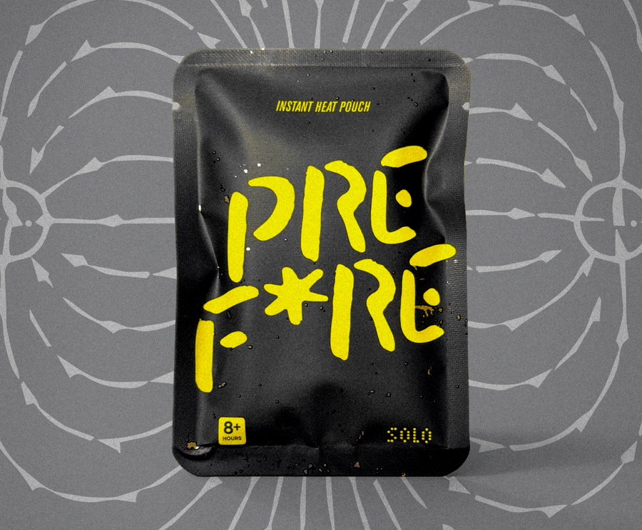
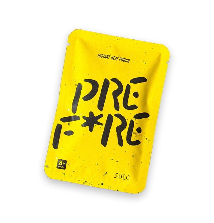
The bright yellow object

On signal, taste, and why a hand warmer probably should not look embarrassed to exist.
At some point in the process of building PREFIRE, we had to answer a very serious business question.
What colour should the hand warmer be?
This is the kind of question that sounds small until you are actually responsible for answering it. Then suddenly it becomes enormous. Annoyingly enormous. The sort of thing you think about in the shower, in the car, while pretending to listen to someone describe a logistics issue you also genuinely need to understand.
Because colour is never just colour.
Not when you’re trying to build a brand around an object people are used to ignoring.
A hand warmer is small. Soft. Disposable. Usually hidden. Most of the category looks like it was designed to disappear into a mitten and never emotionally trouble anyone again. Beige. White. Orange. Generic. Slightly medical. Slightly camping aisle. Slightly “the procurement team picked this in 2006 and no one has asked a follow-up question since.”
That was exactly the problem.
If PREFIRE was going to be different, it couldn’t whisper.
It had to announce itself without screaming.
It had to feel warm before it was warm.
It had to look like something.
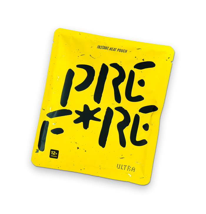
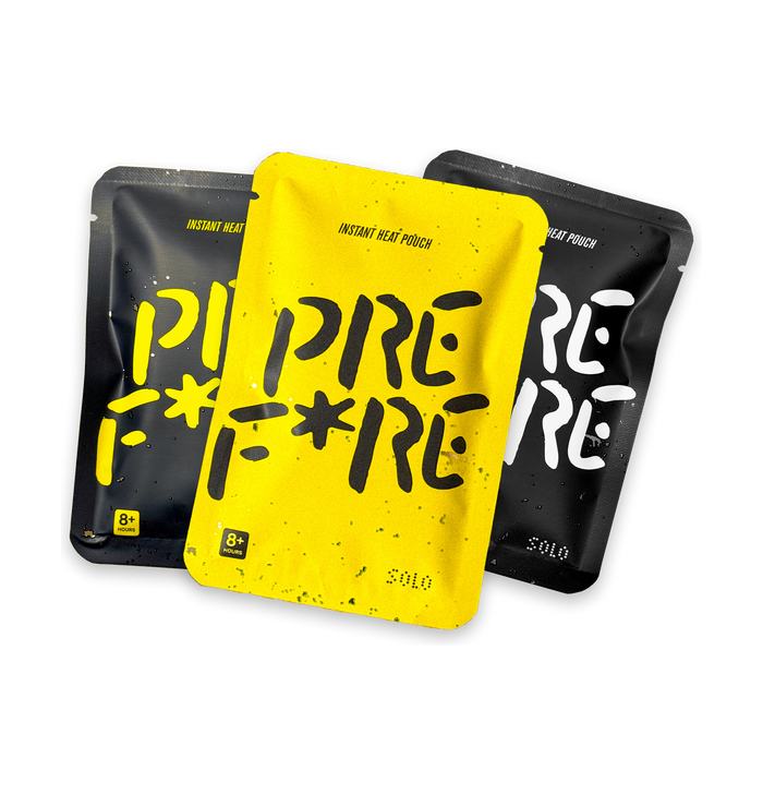
So we made it yellow.
Bright yellow.
Not polite yellow. Not “buttercream lifestyle brand” yellow. Not “sunny little accent colour in a DTC mood board” yellow.
Yellow-yellow.
Visible from across the room yellow.
A tiny hazard sign for comfort.
A small rectangle of heat that looked like it knew it had a job.
The Colour Wasn’t Invented For PREFIRE
There’s an important truth missing if I tell this story as though yellow arrived through some pristine strategic exercise.
It didn’t.
Ryan and I have been making things together for more than fifteen years.
Before PREFIRE there were art shows, posters, identities, furniture experiments, album art, installations, client work, agency work, side projects, things that shipped, things that absolutely should not have shipped, and a long trail of half-serious creative rabbit holes that probably made sense only to us.
And weirdly, across all of it, we kept coming back to this yellow.
Always this yellow.
Not any yellow.
This yellow.
It started feeling less like a preference and more like a recurring character in our work.
It would appear in a poster, then resurface in an object, then show up in some piece of visual experimentation years later like it had been waiting.
A kind of visual home base.
Which is why, when PREFIRE started becoming real and we understood the brief — not just make a hand warmer, but make an overlooked object feel iconic, visible, warm, athletic, industrial, optimistic and unmistakable — it almost felt like there was only one answer.
Of course it was this yellow.
The yellow we always use.
The yellow we’ve trusted for years.
The yellow that somehow manages to feel like energy and restraint at the same time.
People sometimes talk about design decisions as though they emerge from pure rationality.
Often they emerge from memory.
Taste accumulated over time.
Patterns you’ve been building unconsciously for years before a product gives them a place to land.
That is much closer to what happened here.
In some ways, PREFIRE didn’t invent the yellow.
It gave the yellow its proper object.
And I love that.
Because it means the product carries history inside it.
Friendship inside it.
Shared instincts inside it.
That makes the object feel deeper to me.
It’s not branding layered on top.
It’s continuity.
And honestly once we saw it on the pouch, there was this immediate feeling we’ve had a few times over the years when a design decision clicks all the way into place.
That dangerous feeling of:
…well now it can only be this.
Those are usually the right decisions.
The Category Was Trying Very Hard Not To Be Seen
Before PREFIRE, I ordered every hand warmer I could find.
I was deep in it. Cutting them open, reading packaging, testing pouch materials, feeling fabrics, comparing heat curves, staring at tiny legal warnings, and generally behaving like someone who had either found a business idea or needed a more relaxing hobby.
One thing became obvious very quickly.
Most hand warmers were visually apologizing for themselves.
They did the job, sure. Many of them worked perfectly well. But the object itself had no confidence. It was treated like an insert, not a product. Something you tolerated because your fingers were cold. Something that lived inside a glove, inside a pocket, inside packaging, inside a category no one had revisited in years.
That felt strange to me.
Because the actual experience of using a hand warmer can be surprisingly intimate.
You hold it. You squeeze it. You keep it close. You pass it to someone. You tuck it into a pocket and check on it unconsciously. It becomes this small warm presence in your day.
That deserves more than beige.
I don’t mean that every useful product needs to become a design object. There is a special place in my heart for ugly things that work. But some objects are overlooked not because they lack potential, but because no one has bothered giving them a point of view.
That was how the category felt.
Not broken.
Under-seen.
Why Yellow Made Sense Before It Made Sense
Sometimes brand decisions happen before the strategy deck catches up.
Yellow felt right before I could fully explain why.
It had heat in it, but not the obvious kind. We did not want flames. Flames are too literal. Too gas station. Too “energy drink motocross banner in 2003.” We wanted warmth, intensity, signal, optimism, sport, focus, and a little bit of controlled danger, without turning the product into a cartoon.
Yellow did that.
Yellow is caution tape and sunlight. Construction gear and highlighters. Warning signs and smiley faces. Tennis balls. Tour de France jerseys. School buses. Utility knives. Raincoats. Goalkeeper kits. Stanley tools. Taxi cabs. Energy, visibility, safety, movement.
It can be industrial and emotional at the same time.
That tension was perfect.
Because PREFIRE lives in a similar tension.
Practical but expressive. Useful but emotional. Simple but considered. A product you can toss in a bag, but also one we hope you notice.
Yellow gave the pouch a job beyond warmth.
It made it a signal.
A Hand Warmer You Could Recognize From Across The Room
One of the most useful tests for a brand object is whether it survives distance.
Can you spot it quickly?
Can someone describe it in a sentence?
Can it become shorthand?
The yellow pouch gave us that.
Before there was a huge brand world, before we had enough content, before partnerships, before endless conversations about Shopify, SEO, Meta ads, creators, retail buyers, cartons, case packs, and all the other fun little goblins that appear once you start selling physical products, we had the object.
The bright yellow object.
That mattered.
Because in a young brand, you need simple assets that can carry a lot of weight. You do not yet have decades of memory. You do not yet have massive distribution. You do not yet have cultural permission. You have to build recognition from fragments.
A colour can do some of that work.
A shape can do some of that work.
A line like GET HEATED can do some of that work.
Little pieces of memory.
That is what you’re building at the start.
Not a perfect brand system.
Memory.
The Virgil Thing
I think about Virgil Abloh’s 3% rule more than is probably healthy for someone making hand warmers.
The idea, loosely, is that you can create something new by changing an existing thing just enough. Not destroying it. Not reinventing from zero. Just shifting it slightly so people see it differently.
That felt like PREFIRE.
We were not trying to make hand warmers unrecognizable. That would be dumb. The whole point is that the product already works. It has a known purpose. It belongs to winter, sport, outdoors, gaming, commuting, sidelines, and all these little moments where people want warmth.
The move was not to erase the category.
The move was to tilt it.
Make it brighter. Make it softer. Make it feel more intentional. Make the language sharper. Make the object visible.
Maybe that is only a 3% change.
But sometimes 3% is enough to make people look again.
That’s the magic trick we were chasing.
A hand warmer, but seen.
The Fear Of Looking Too Designed
There is a funny anxiety that comes with trying to elevate a basic object.
You start wondering if you are being ridiculous.
Are we really talking about the semiotics of a hand warmer colourway?
Are we really asking whether this pouch has enough visual confidence?
Are we really debating whether yellow should feel more industrial, more sport, more warm, more iconic?
Yes.
Unfortunately, yes.
And I think that’s part of the job.
If you don’t take the small things seriously, no one else will.
That doesn’t mean becoming precious. Precious is dangerous. The product still has to work. It still has to be affordable enough, shippable enough, understandable enough, useful enough. It cannot become a museum object that also happens to warm your hands.
But there is a difference between precious and considered.
We wanted considered.
We wanted a hand warmer that felt like someone had actually cared what it looked like, felt like, sounded like, and meant.
That should not be radical.
In this category, it kind of was.
Yellow Also Made The Product Less Disposable In Spirit
This is a strange thing to say about a single-use heat pouch, but I think colour can change perceived care.
When something looks anonymous, people treat it anonymously.
When something has identity, they relate to it differently.
That doesn’t magically change the use cycle of the product, but it changes the experience. It makes the pouch feel less like filler and more like an object. Something chosen. Something designed. Something with a little presence.
That matters if you are trying to build a brand in a commodity category.
You cannot rely only on function because function is easy to compare and hard to love. Someone can always ask who has the cheapest pouch, the longest claim, the biggest pack, the deepest discount.
Those questions matter. We don’t get to ignore them.
But brand lives somewhere else too.
Brand lives in the tiny irrational preference.
The one where someone reaches for yours because it feels like theirs.
Yellow helps create that possibility.
The Object Had To Work In Gaming And Outside
This was another constraint.
PREFIRE was born partly through gaming, but we never wanted it trapped there.
The product had to make sense beside a keyboard and on a ski lift. In a hoodie pocket and in a trail pack. At a LAN event and at a cold soccer field. For a pro player and for someone walking the dog at 7 a.m. in February wondering why they live somewhere with wind.
That is a lot to ask from a small pouch.
Yellow gave us range.
In gaming, it felt graphic. Almost like a power-up. Something that could sit beside a mouse and keyboard and actually look intentional.
Outside, it felt visible and useful. A signal object. Something that belonged in a jacket pocket, gear bag, or emergency kit.
In lifestyle contexts, it had a strange charm. A little object of comfort. Bright enough to feel optimistic. Minimal enough not to feel childish.
That range mattered.
Because PREFIRE is not only a gaming brand. It is not only an outdoor brand. It is not only a wellness-ish comfort brand. It has to move between those worlds without changing its clothes completely.
The yellow pouch helps do that.
The Joke Is That It’s Still Just A Hand Warmer
This is the part I want to keep honest.
We can talk about signal, iconography, colour systems, category transformation, Virgil, industrial design, emotional utility, and the cultural meaning of small objects.
And at the end of the day, it is still a hand warmer.
You open it. You shake it. It gets warm.
That’s the whole thing.
I love that.
The humility keeps the ambition from floating away.
Because no matter how much brand thinking we wrap around PREFIRE, the object still has to do the basic job. Warm hands. Stay warm. Feel good. Be useful. Earn its place.
If it doesn’t do that, the yellow is just costume.
And nobody needs costume.
They need warmth.
So the design has to serve the product, not distract from it.
That is always the line.
Make it special without making it silly.
Some days that line feels very thin.
Why The Bright Yellow Object Became The Brand
At some point, I stopped thinking of yellow as a colour choice and started thinking of it as the brand’s first real asset.
The object carried the idea before anything else could.
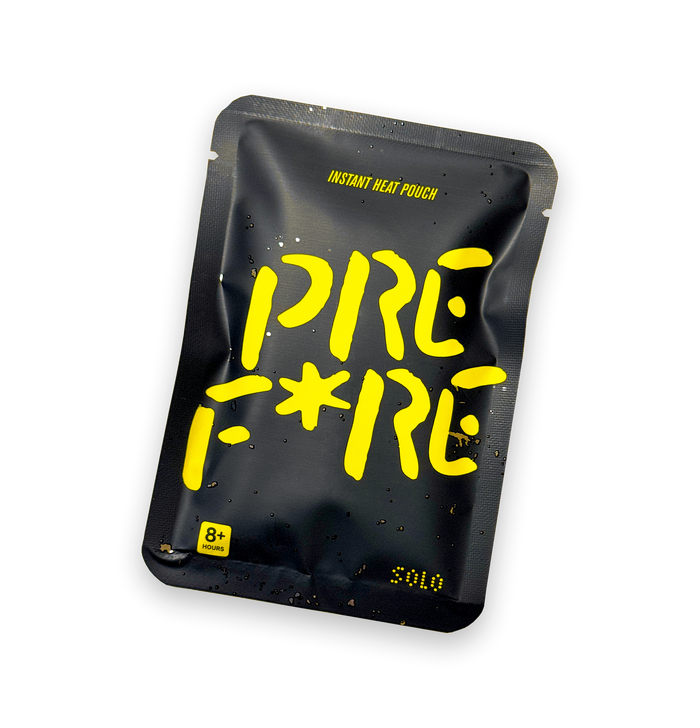
PREFIRE is a bright yellow instant heat pouch.
That sentence does a lot.
It tells you what it is. It gives you an image. It creates memory. It makes the product specific. You can almost see it without seeing it.
That’s powerful.
Especially for a young company.
Because early on, clarity is oxygen.
If people cannot remember what you are, you are in trouble. If they cannot picture the thing, you are in trouble. If your product blends into the drawer with everyone else’s, you are in trouble.
Yellow gave us a fighting chance.
A tiny rectangle of differentiation.
Sometimes that is where brands begin.
Not with the manifesto.
With the thing people remember.
A Small Object With A Lot Of Pressure On It
I do feel bad for the pouch sometimes.
It has a lot to do.
It has to warm your hands. It has to feel soft. It has to communicate the brand. It has to stand out in content. It has to photograph well. It has to sit in the hands of gamers, hikers, skiers, parents, commuters, creators, and people who simply run cold. It has to be simple enough for anyone to understand and interesting enough for someone to care.
No pressure, little guy.
But that is also why the object is exciting.
A small thing carrying a lot of meaning is basically the entire PREFIRE challenge.
And maybe the entire PREFIRE opportunity.
So Why Yellow?
Because the product needed to be seen.
Because warmth deserved a signal.
Because the category was too quiet.
Because we wanted something simple enough to remember and strong enough to build around.
Because utility does not have to be invisible.
Because a hand warmer probably should not look embarrassed to exist.
And because, at some point, the bright yellow rectangle started feeling inevitable.
That is usually how you know a decision is working.
It stops feeling like a choice.
It starts feeling like the thing was always supposed to be that way.
One Last Thought
I still think about how funny this all is.
How much meaning we are asking a small yellow pouch to carry.
How many conversations have come from a decision that could have been reduced to “make it bright.”
How something so simple became the visual heart of the brand.
But that’s the work, isn’t it?
Taking small things seriously enough that they become bigger.
The pouch is yellow because we wanted PREFIRE to be remembered.
But also because we wanted the object to feel awake.
Alive.
Like warmth had a shape.
Like heat had a signal.
Like a hand warmer could finally stop hiding.
That still feels right to me.
Bright yellow and all.